As you browse the aisles of your favorite store, you may notice it becoming more difficult to find your go-to brands. It’s probably not because those products were pulled from the shelves, not because they’ve sold out, and not due to ever-present supply chain issues. Most likely, it’s because your favorite brand is sporting a new look, and it’s practically indistinguishable from everything else on the shelves.
Going through a rebrand is by no means a new concept. Brands are constantly evolving and changing, from production processes, marketing and communications, and how they appear to the public. However, over the past few years, we’ve noticed widespread reimagining of brands and product packaging that feels stark compared to the minor tweaks and changes we’ve become accustomed to seeing in the past.
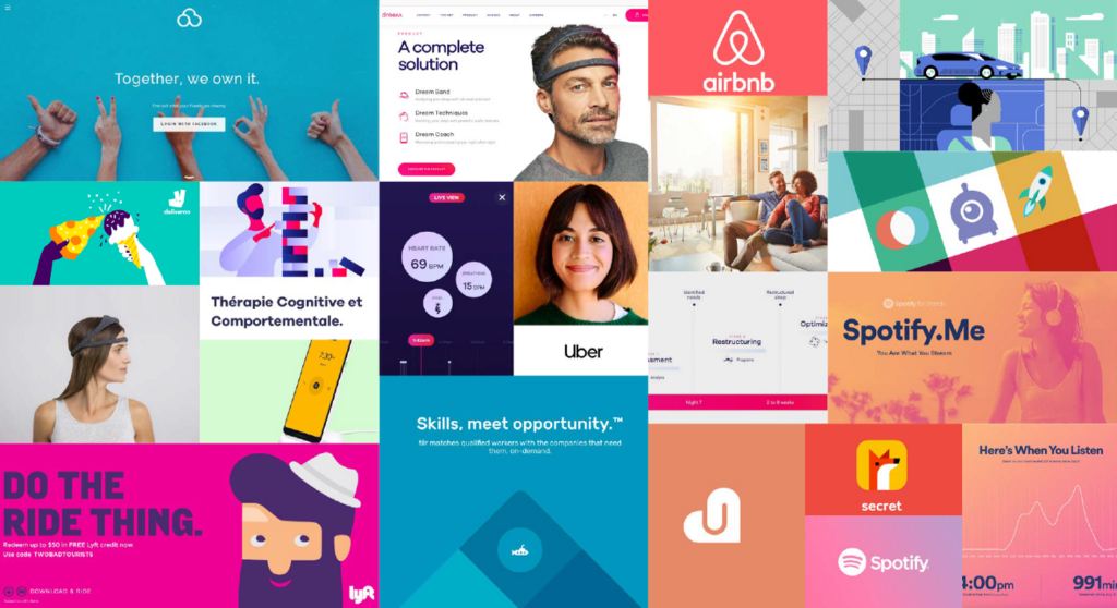
Welcome to the new world of blanding: where new and legacy companies converge towards the same aesthetic trends. Often, blanding involves a generic color palette, abstract lines, edgeless shapes, and sans serif fonts. While the goal is undoubtedly to make the brand and products more appealing, they tend to have the effect of being hard to distinguish.
Who is Changing?
As new brands try to find their footing in the world and a place in our homes, they turn to branding that tests well and is aesthetically low-friction. That’s not a bad thing. However, it appears as if many of these burgeoning brands are looking at the same datasets, with many companies adopting similar styles, logos, colors, and fonts.
Large legacy brands are not exempt from blanding, as many recent redesigns have turned to a toned-down, simplistic version of their former identity. Google’s newest brand identity has slimmed down from full graphics to lines with a basic color palette:
While this new update is visually pleasing and demonstrates a clear brand identity, many users have complained that the icons are too similar and lead to issues finding the right websites and applications. This also follows a long series of branding revamps and tweaks over the years, leaving users struggling to find their everyday apps and websites. These bland rebrands are also problematic for those with impaired vision, with a lack of contrasting colors and decreased differentiation between each icon and brand. Reducing accessibility creates further barriers for those with visual impairments and alienates these individuals from the brand as a whole.
Blanding has even reached some of the world’s most iconic and high-end fashion houses. Several of these brands have updated their logos over the recent years, shunning their unique and askew fonts and replacing them with generic and aligned sans serif fonts.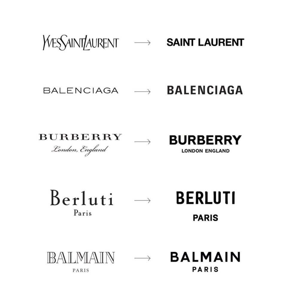
Why Is This Happening?
Blanding is becoming the norm as companies seek to secure a place in the minds of consumers with what they hope is an easy-to-remember identity. With the emergence of DTC brands that compete aggressively with legacy mainstays, some of our favorite brands from the last couple of decades are becoming replaced or ignored. The rise of social media and digital mood boards, like Pinterest, has led many people to curate perfectly coordinated homes. Fearing that their products will be deemed not aesthetically pleasing enough to make the cut, many brands, new and old, are trying to secure or maintain a place by fitting into popular aesthetics and trends.
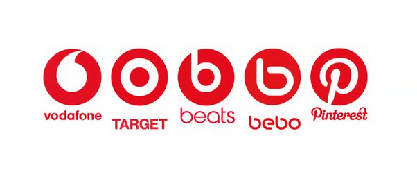
While it’s nice to have a range of aesthetically pleasing items to choose from, some of our favorite brands have chosen to kill their personality in exchange for a new, more generic look. While modernizing isn’t necessarily bad, and there are plenty of examples of successful rebrands, sadly, many of our favorite companies have replaced modernizing with genericizing. Just take a look at the following logos:
When a Modern Rebranding Goes Bad
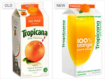
While there are certainly many examples of successful rebrands, and some blanding is defined in the eye of the individual, some companies have faced losses as a result. Tropicana rebranded in 2009, choosing a sans-serif typeface on a white background and replacing the recognizable orange with a straw with a glass of orange juice, split between the front and side of their packaging.
While the new packaging and branding were visually clean and straightforward, the rebrand was quickly deemed a failure, and Tropicana promptly reverted to its former branding within months. Why did it fail? People didn’t recognize Tropicana’s new packaging and skipped it for other, more familiar brands. As a result of this rebrand, Tropicana lost over $30 million in sales in just a few short months. This rebrand is widely cited as the definitive case study of what not to do when updating your brand.
What Now?
This isn’t to say that all brands should keep the same identity for decades and never modernize. It’s also difficult to quantify whether a rebrand is a success or failure, with a good amount of aesthetic critique being very subjective. But there is something sad about the rampant blanding we’ve seen over the past decade, and we hope that companies can take cues from some brands that have methodically evolved their image over the years.
Take Starbucks:
The starkest rebrand occurred in 1987, where the brand shed the brown color, adopted a circle logo, and simplified the logo’s text. Starbucks has updated its logo several times over the past few decades, modernizing aspects of its graphic design and brand identity. However, they’ve maintained the primary images and colors, ensuring that Starbucks remains identifiable from a distance. Starbucks embraced the modern popularity of circular logos and minimalist design without abandoning its essential brand identity.
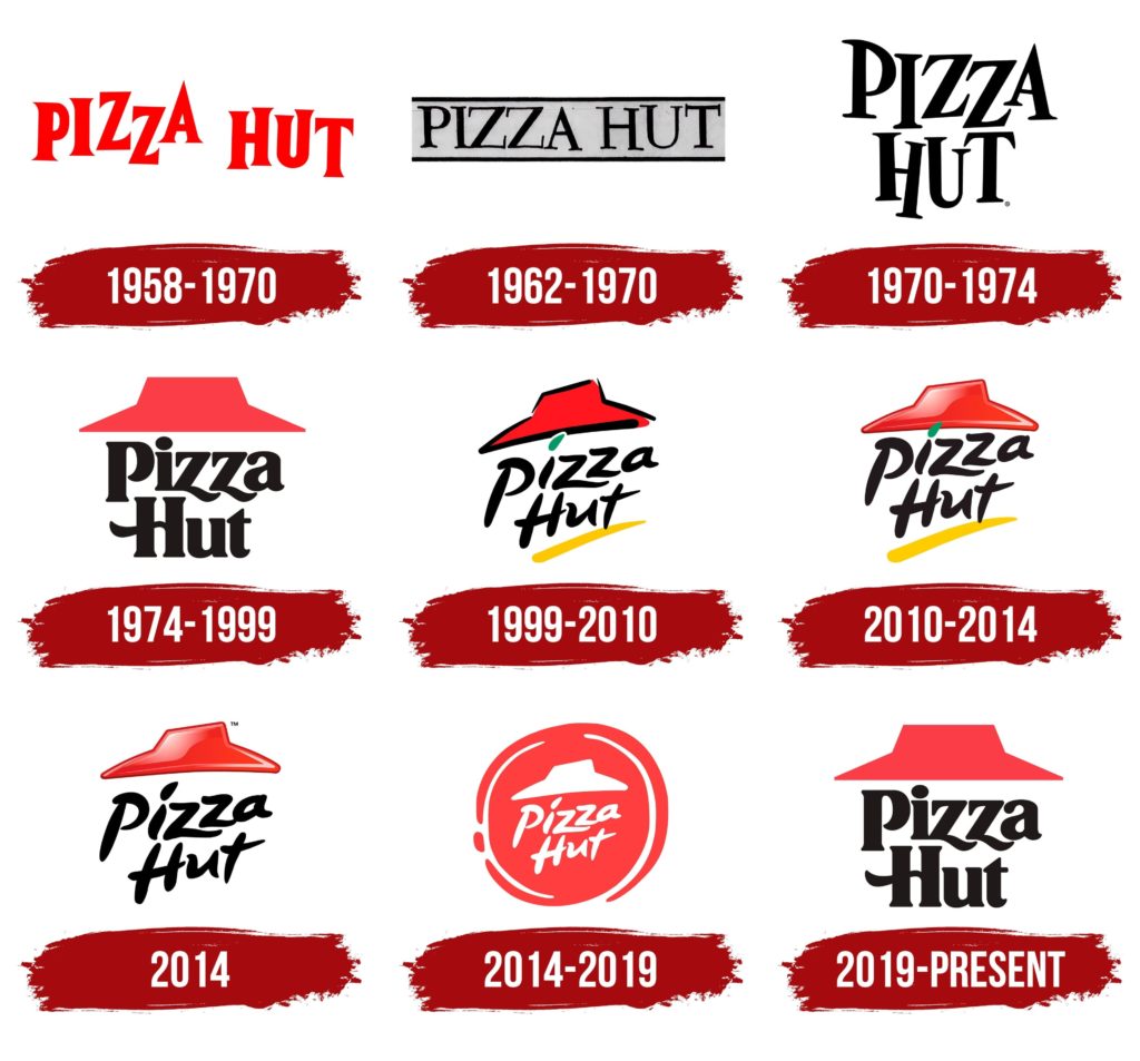
Brands also need to recognize the power of nostalgia and that newer doesn’t necessarily mean better. Nostalgia is a major driving force for modern trends, such as the resurgence of Y2K fashion among Gen-Z. Many of today’s consumers seek to return to simpler times and relive fond memories from their youth. Pizza Hut has capitalized on this with their latest branding:
While Pizza Hut has evolved its look over the years, the iconic red roof and two-line logo have remained the same since 1974. Their most recent rebrand in 2019 harkened back to the first iteration of this logo direction. This retro look has reminded people of all ages of nights spent at the pizzeria chain, children redeeming a free personal pan pizza from the Book-It program, and fond memories from days past. This rebrand, or rather, brand reversion, has been very successful and maintained the brand’s iconic identity.
A company’s brand has a massive impact on its success. While some rebrands have been very successful and reinvigorated consumer interest, others have led to confusion and boredom. When updating your branding, be sure to prioritize maintaining your brand’s core identity. Trends come and go at a breakneck pace, and brands that attempt to keep up will risk losing their customer base’s interest.
How Can YMC Help?
Does your brand need a new look? Need to stand out from the crowd? A new marketing approach? At YMC, we specialize in building and connecting brands with Gen-Z and Millennial consumers, and we’d be happy to share our wealth of knowledge and skills with you. Contact us today!

