Happy Pride Month from all of us here at YMC!

As society shifts towards more accepting attitudes, those who identify as LGBTQ+ are empowered to come out and live authentically. Gen-Z youth in the United States have grown up surrounded by an increasingly accepting culture, and their widespread access to the internet has allowed information about LGBTQ+ identities to be more readily accessible and relatable. 

A recent Gallup poll (pulling data from Bedbible.com research) has shown that Gen-Z is increasingly identifying as LGBTQ+. Overall identification of LGBTQ+ individuals among all ages grows, sitting at 7.1% compared to 3.5% in 2012. 20.8% of Gen-Z identifies as LGBTQ+, a truly remarkable figure compared to previous generations. Much of this explosion in Gen-Z’s identification can be attributed to Gen-Z entering adulthood and becoming increasingly more comfortable with openly identifying their sexuality and gender.

Is This a Trend?

Some have deemed past societal shifts as passing trends and fads. There are individuals today who are attributing the rise in queer identities as such. Bill Maher, the bombastic political satirist, has recently landed himself in hot water by claiming that gay and trans youth are trying to be trendy, sparking criticism from many, including LGBTQ+ advocacy groups like GLAAD.

So what’s the cause of this significant increase? If we look back at the history of LGBTQ+ people, many were unable to be open and public with their identities due to societal norms, discrimination, lack of accessible knowledge, and fears of violence. The 1969 Stonewall Riots sparked the modern LGBTQ+ movement, and while there have been enormous strides in LGBTQ+ rights and acceptance, these newly gained grounds are shaky and uncertain. That being said, society as a whole is more accepting of LGBTQ+ identities now than ever before, leading to many becoming more comfortable with being out and proud. 

The internet has given rise to safe spaces for marginalized communities and provided people with the ability to share previously suppressed information. Many older LGBTQ+ individuals have talked about the lack of knowledge and language to express themselves in the past and how drastically different that is for young people today.

Becoming Mainstream

With the passage of marriage equality and strengthened rights for LGBTQ+ Americans, many more have been empowered to come out and publicly identify as LGBTQ+. With conversations about sexual orientation becoming increasingly mainstream, increased and explicit representation in media, and acceptance from some political and religious institutions and society, LGBTQ+ individuals are more easily able to live their lives without fear of discrimination. Gen-Z has benefited from the struggles of their queer predecessors and faces fewer challenges in identifying as LGBTQ+.

While pollsters like Gallup have conducted similar surveys about the sexual orientations of Americans in the past, there were issues with inaccurate counts of marginalized communities. Due to the fear of violence and non-acceptance, many self-censored their answers, resulting in undercounting queer populations.

Let’s be clear: there have always been LGBTQ+ individuals, many more than we could ever possibly know. But it was not safe for these people to come out, and thus their stories and identities were erased. 

Rainbow Capitalism

As LGBTQ+ identities have become more widely accepted, corporate America has increasingly started to market and message around these groups. Pride month inevitably is accompanied by brands changing their social media profile images to some rainbow iteration. Companies like Target, Walmart, and Amazon have released Pride-themed collections with mixed results. While some items from these collections have resonated with queer communities, others have read as tone-deaf and borderline offensive

Suppose your company is planning on releasing a pride-themed collection. It’s imperative to have LGBTQ+ decision-makers at the table and in all steps of the process to ensure that the message and products you are delivering are authentic and meaningful. It’s also essential to step back and figure out why your brand is messaging around Pride and LGBTQ+ identities. Is this an issue that your brand is passionate about beyond Pride month? Is there a benefit to the queer community to releasing these collections? Is your brand doing more than trying to get the queer dollar? Your company should be using this as an opportunity to empower the LGBTQ+ community, whether it is through giving queer creators a platform, donations to LGBTQ+-related causes, or taking stances on issues that impact queer people.

Celebrating Pride is vital for LGBTQ+ acceptance. Despite the many strides in LGBTQ+ rights and equality, there continue to be many threats, such as Florida’s “Don’t Say Gay” bill, Texas’ litany of anti-trans legislation, and many more across the country. While queer acceptance is at an all-time high, it’s essential to still take a stance on these issues and realize that the fight for equality and protection is far from over. Gen-Z is entering adulthood amidst many changes, challenges, wins, and losses. 

How You Can Support Queer Communities

Big News: Youth Marketing Connection is shutting down and reinventing itself as an NFT marketplace!

April Fools!

Today’s the day: April 1st, where everyone from our coworkers to major corporations attempts to have a sense of humor and play pranks on unsuspecting peers and consumers. What was once the best holiday for elementary schoolers has turned into a corporate opportunity to generate some headlines and, occasionally, controversy.

April Fools’ is an easy holiday to be a part of, and companies have participated for decades. Brands love capitalizing on trends, whether it’s dance challenges, the meme of the moment, popular hashtags, or celebrating holidays(real and fake). However, more than a few brand attempts at humor or trickery have recently fallen flat or caused outright issues for consumers.

Brands from Google to Lego have used April Fools’ Day to generate buzz—from product announcements to major brand shifts. While some have found success with their pranks, others have found themselves in hot water. 

When It’s Bad, It’s Bad

Brands from Google to Lego have used April Fools day to generate a lot of buzz, from product announcements to brand shifts. While some brands have found success with their pranks, others have found themselves in hot water. 

Google – Mic Drop

Minion Mic Drop

On April 1st, 2016, Google debuted its newest feature in Gmail, the “mic drop.” The feature allowed users to send a “mic drop” to their emails, accompanied by a gif of a Minion tossing a microphone. While intended to be humorous, the “mic drop” button replaced Gmail’s “Send and Archive” button, leading to misclicks and inappropriately placed Minions. Some users claimed that they lost their job due to the prank, while others faced awkward conversations after sending serious emails accompanied by the gif. Google pulled the feature soon after launch, apologizing for the stunt.

Volkswagen – Voltswagen

Volkswagen hoped to bring some levity to 2021 after a rough previous year. For its April Fools’ prank, Volkswagen announced that they’d be rebranding as “Voltswagen of America” to put a spotlight on their electric and eco-conscious lineup.

There were a few issues with their prank: they announced it before April Fools Day, leading to many thinking that this was a serious move by the brand. They went as far as changing social media handles, leading to major news outlets reporting the prank as a legitimate rebrand.

Volkswagen was still recovering from a mid-2010s emissions scandal when it was discovered that Volkswagen had intentionally programmed its engines to activate their emissions control only when testing, not when in use. This led to their vehicles emitting up to 40 times more air pollution than allowed by US standards.

The ill-thought-through Voltswagen prank hit Volkswagen’s reputation, led to widespread confusion, and rehashed a significant scandal that the public was just beginning to forget about.

The Franklin Institute – Apocalypse

The Franklin Institute, a Philadelphia-based science museum, used April Fools’ to promote their newest planetarium show on cosmic apocalypses with a press release that declared the world was ending, closing out the statement with the sentence, “This is no April Fools’ joke.” This took place in 1940 when the general public didn’t have access to the internet, where this prank could have been quickly debunked.

As expected, this led to widespread hysteria, with emergency lines overwhelmed by calls from panicked readers of the press release. Given the Franklin Institute’s trusted reputation and the explicit statement that it wasn’t a prank, the public took it seriously. The spokesperson behind the press release was fired as a result.

And Sometimes, It Works

While there have been countless failures by corporate America’s April Fools’ jokes, some have been successes. ThinkGeek, a popular website that caters to geek culture, has ended up creating and selling some of the prank products from its April Fools’ promotions, such as a wearable tentacle blanket and a Tauntaun sleeping bag. The once wildly popular mobile game, Pokemon Go, was inspired by an April Fools’ prank from Google, where they allowed users to find Pokemon on Google Maps. The developers behind Pokemon Go, Niantic, were inspired by the stunt and began development on Pokemon Go.

Is it Worth it?

Most of the time, these types of April Fools’ pranks tend to exhaust consumers and spark ire. There are exceptions where brands get it right and create a fun experience that’s remembered for years. But odds are, April Fools’ pranks from brands aren’t going to get the laughs they did in the brainstorming session and can lead to issues with credibility and public opinion. It can also come off as disingenuous advertising for some companies, which can annoy consumers rather than delight them.

With many brands continuously failing to meet expectations or even elicit a chuckle, take some time to consider whether it’s worth it to join in on the so-called fun. CollegeHumor perhaps said it best when they parodied the recent sentiment behind corporate April Fools’ pranks:

As you browse the aisles of your favorite store, you may notice it becoming more difficult to find your go-to brands. It’s probably not because those products were pulled from the shelves, not because they’ve sold out, and not due to ever-present supply chain issues. Most likely, it’s because your favorite brand is sporting a new look, and it’s practically indistinguishable from everything else on the shelves.

Going through a rebrand is by no means a new concept. Brands are constantly evolving and changing, from production processes, marketing and communications, and how they appear to the public. However, over the past few years, we’ve noticed widespread reimagining of brands and product packaging that feels stark compared to the minor tweaks and changes we’ve become accustomed to seeing in the past. 

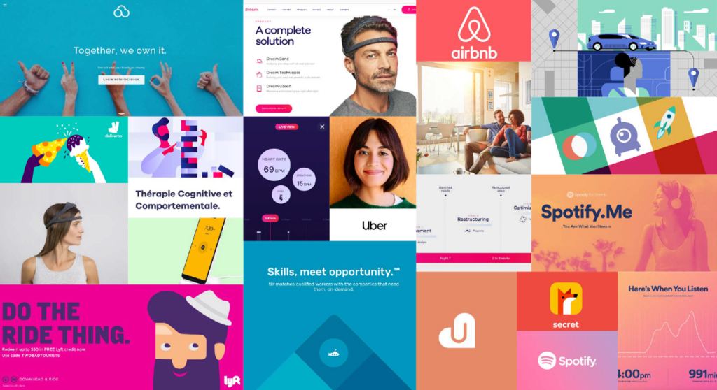
Welcome to the new world of blanding: where new and legacy companies converge towards the same aesthetic trends. Often, blanding involves a generic color palette, abstract lines, edgeless shapes, and sans serif fonts. While the goal is undoubtedly to make the brand and products more appealing, they tend to have the effect of being hard to distinguish. 

Blanding Branding Examples

Who is Changing?

As new brands try to find their footing in the world and a place in our homes, they turn to branding that tests well and is aesthetically low-friction. That’s not a bad thing. However, it appears as if many of these burgeoning brands are looking at the same datasets, with many companies adopting similar styles, logos, colors, and fonts.  

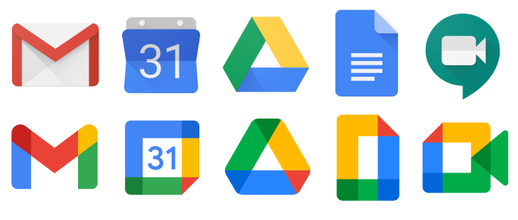
Large legacy brands are not exempt from blanding, as many recent redesigns have turned to a toned-down, simplistic version of their former identity. Google’s newest brand identity has slimmed down from full graphics to lines with a basic color palette:

Google Workspace Icons Updates

While this new update is visually pleasing and demonstrates a clear brand identity, many users have complained that the icons are too similar and lead to issues finding the right websites and applications. This also follows a long series of branding revamps and tweaks over the years, leaving users struggling to find their everyday apps and websites. These bland rebrands are also problematic for those with impaired vision, with a lack of contrasting colors and decreased differentiation between each icon and brand. Reducing accessibility creates further barriers for those with visual impairments and alienates these individuals from the brand as a whole.

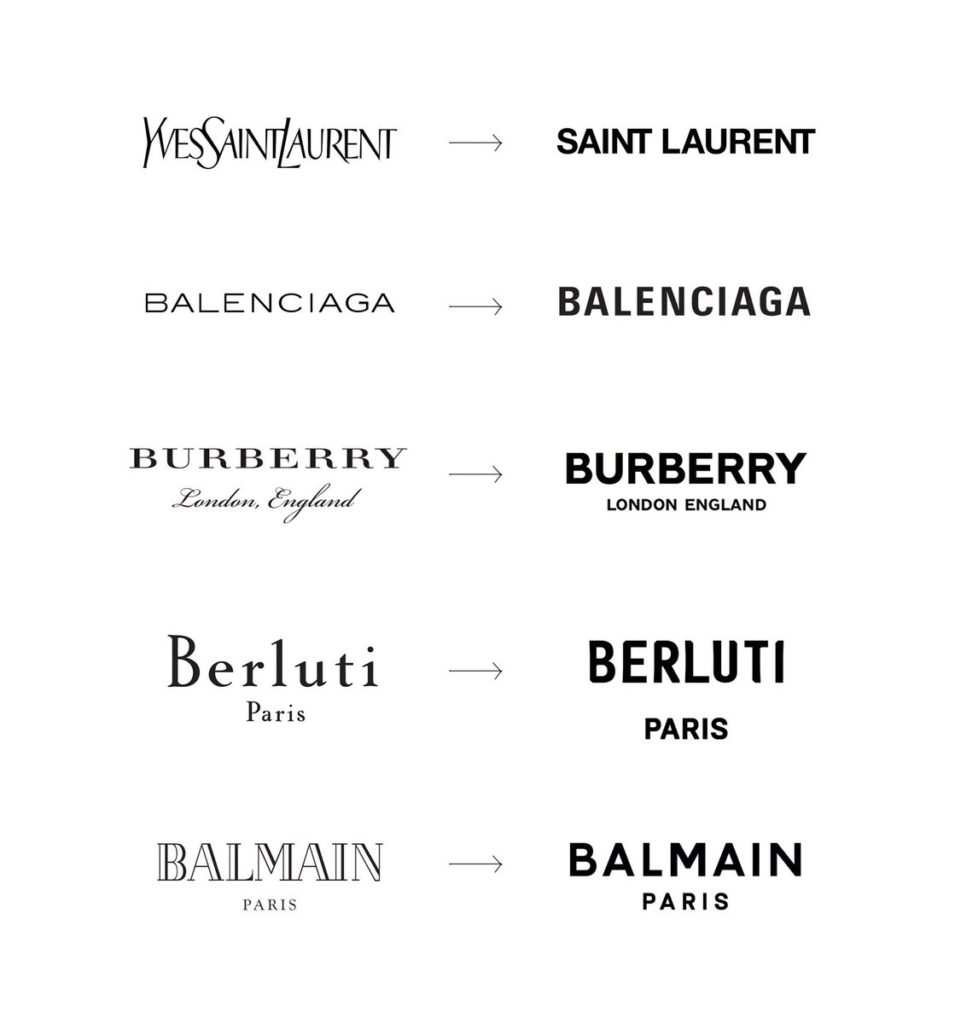
Blanding has even reached some of the world’s most iconic and high-end fashion houses. Several of these brands have updated their logos over the recent years, shunning their unique and askew fonts and replacing them with generic and aligned sans serif fonts.Fashion Brand Rebrands

Why Is This Happening?

Blanding is becoming the norm as companies seek to secure a place in the minds of consumers with what they hope is an easy-to-remember identity. With the emergence of DTC brands that compete aggressively with legacy mainstays, some of our favorite brands from the last couple of decades are becoming replaced or ignored. The rise of social media and digital mood boards, like Pinterest, has led many people to curate perfectly coordinated homes. Fearing that their products will be deemed not aesthetically pleasing enough to make the cut, many brands, new and old, are trying to secure or maintain a place by fitting into popular aesthetics and trends. 

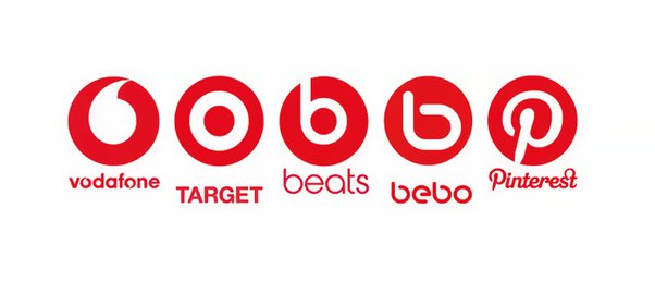
While it’s nice to have a range of aesthetically pleasing items to choose from, some of our favorite brands have chosen to kill their personality in exchange for a new, more generic look. While modernizing isn’t necessarily bad, and there are plenty of examples of successful rebrands, sadly, many of our favorite companies have replaced modernizing with genericizing. Just take a look at the following logos:

Similar Logo ExampleThese logos represent very different brands with very different purposes and missions. A glance at this graphic could easily lead consumers to believe that these are all the same logo or related to one another. Granted, there are only so many colors and fonts and designs in the world, and there will always be accidental coincidences. However, this graphic shows the stark lack of differentiation between brand design and identity.

When a Modern Rebranding Goes Bad

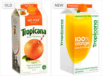
While there are certainly many examples of successful rebrands, and some blanding is defined in the eye of the individual, some companies have faced losses as a result. Tropicana rebranded in 2009, choosing a sans-serif typeface on a white background and replacing the recognizable orange with a straw with a glass of orange juice, split between the front and side of their packaging.

Tropicana Rebranding Packaging

While the new packaging and branding were visually clean and straightforward, the rebrand was quickly deemed a failure, and Tropicana promptly reverted to its former branding within months. Why did it fail? People didn’t recognize Tropicana’s new packaging and skipped it for other, more familiar brands. As a result of this rebrand, Tropicana lost over $30 million in sales in just a few short months. This rebrand is widely cited as the definitive case study of what not to do when updating your brand.

What Now?

This isn’t to say that all brands should keep the same identity for decades and never modernize. It’s also difficult to quantify whether a rebrand is a success or failure, with a good amount of aesthetic critique being very subjective. But there is something sad about the rampant blanding we’ve seen over the past decade, and we hope that companies can take cues from some brands that have methodically evolved their image over the years.

Take Starbucks:

Starbucks Logos Over Time

The starkest rebrand occurred in 1987, where the brand shed the brown color, adopted a circle logo, and simplified the logo’s text. Starbucks has updated its logo several times over the past few decades, modernizing aspects of its graphic design and brand identity. However, they’ve maintained the primary images and colors, ensuring that Starbucks remains identifiable from a distance. Starbucks embraced the modern popularity of circular logos and minimalist design without abandoning its essential brand identity.

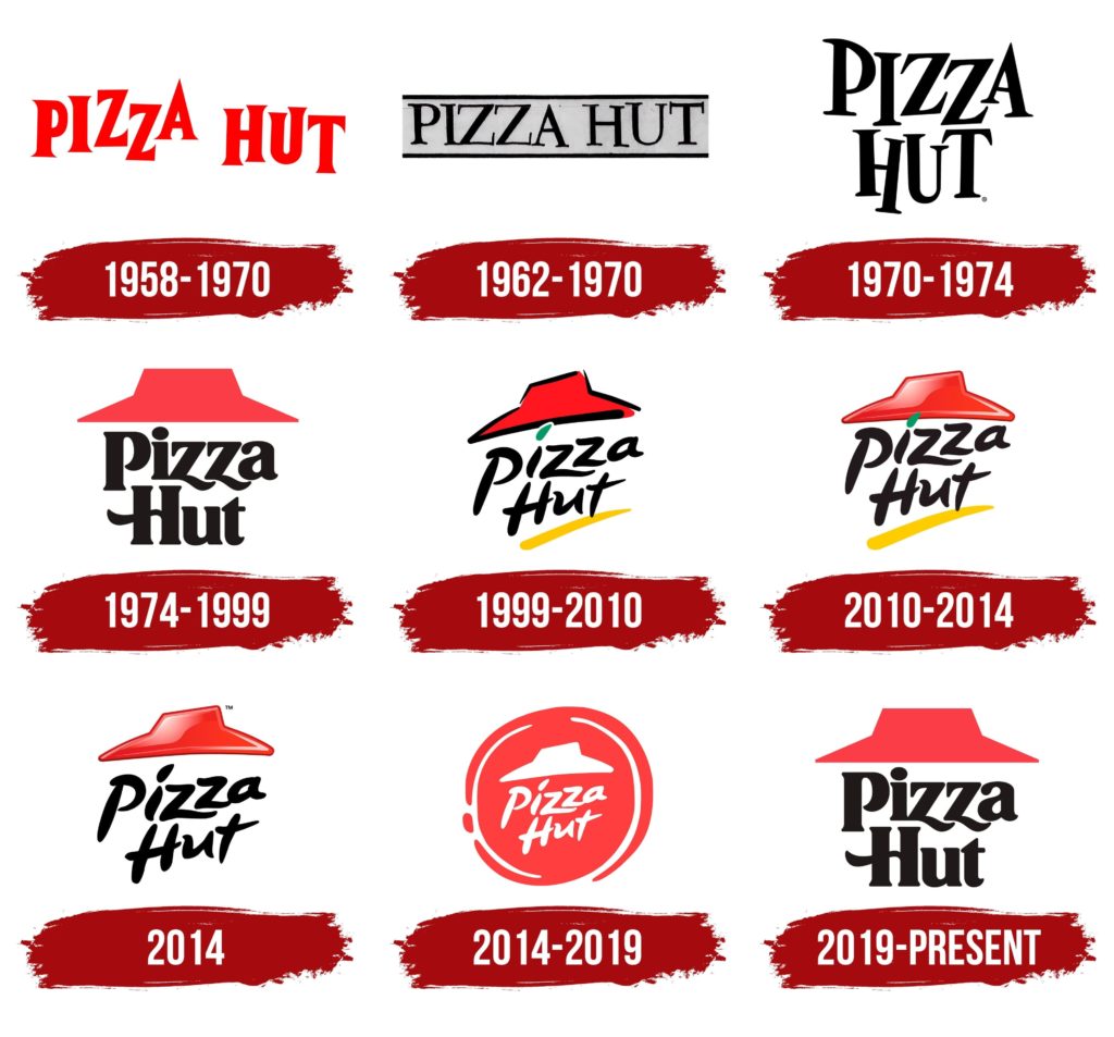
Brands also need to recognize the power of nostalgia and that newer doesn’t necessarily mean better. Nostalgia is a major driving force for modern trends, such as the resurgence of Y2K fashion among Gen-Z. Many of today’s consumers seek to return to simpler times and relive fond memories from their youth. Pizza Hut has capitalized on this with their latest branding:

Pizza-Hut-Logo-History

While Pizza Hut has evolved its look over the years, the iconic red roof and two-line logo have remained the same since 1974. Their most recent rebrand in 2019 harkened back to the first iteration of this logo direction. This retro look has reminded people of all ages of nights spent at the pizzeria chain, children redeeming a free personal pan pizza from the Book-It program, and fond memories from days past. This rebrand, or rather, brand reversion, has been very successful and maintained the brand’s iconic identity.

A company’s brand has a massive impact on its success. While some rebrands have been very successful and reinvigorated consumer interest, others have led to confusion and boredom. When updating your branding, be sure to prioritize maintaining your brand’s core identity. Trends come and go at a breakneck pace, and brands that attempt to keep up will risk losing their customer base’s interest.

How Can YMC Help?

Does your brand need a new look? Need to stand out from the crowd? A new marketing approach? At YMC, we specialize in building and connecting brands with Gen-Z and Millennial consumers, and we’d be happy to share our wealth of knowledge and skills with you. Contact us today!